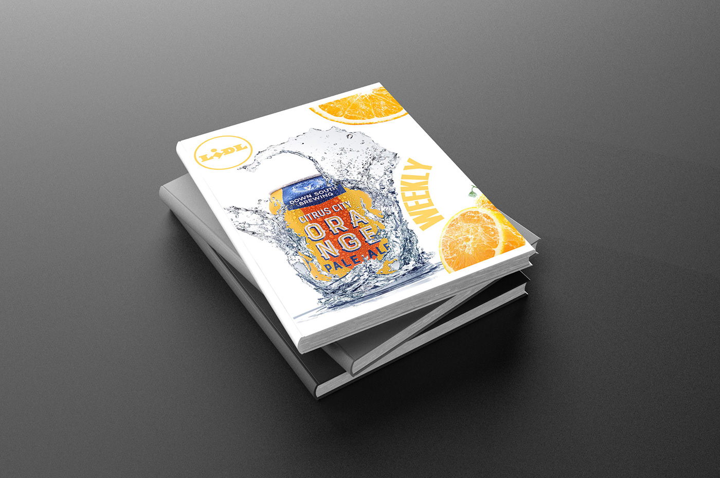
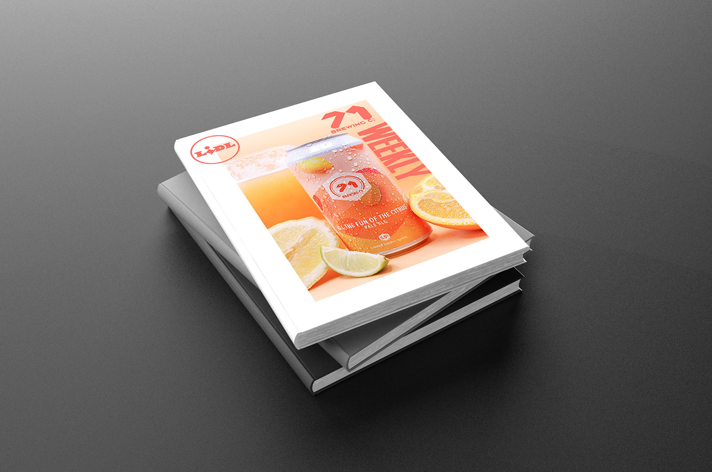
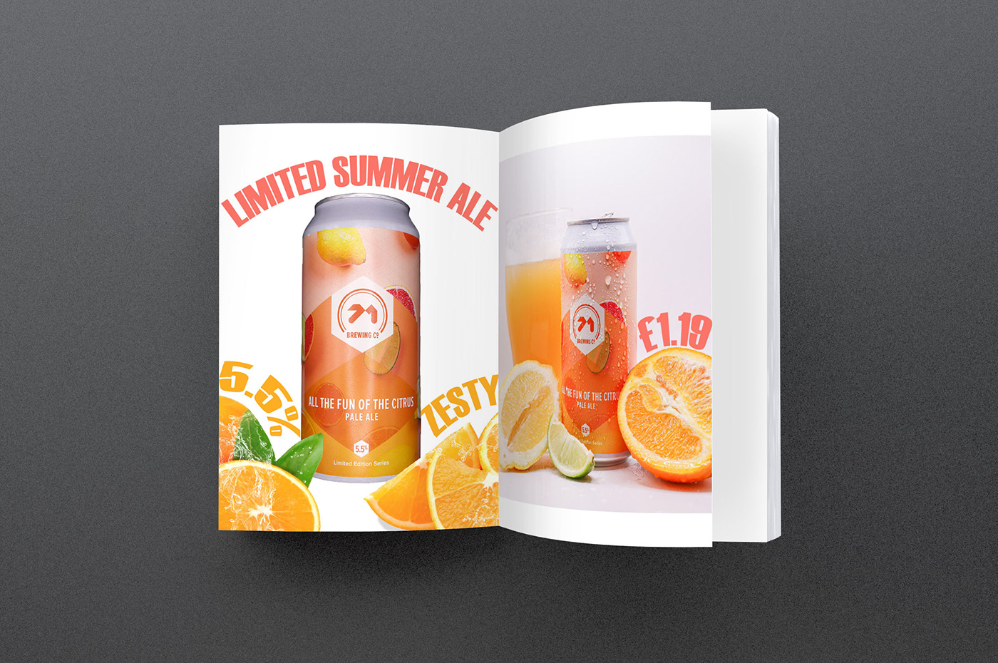
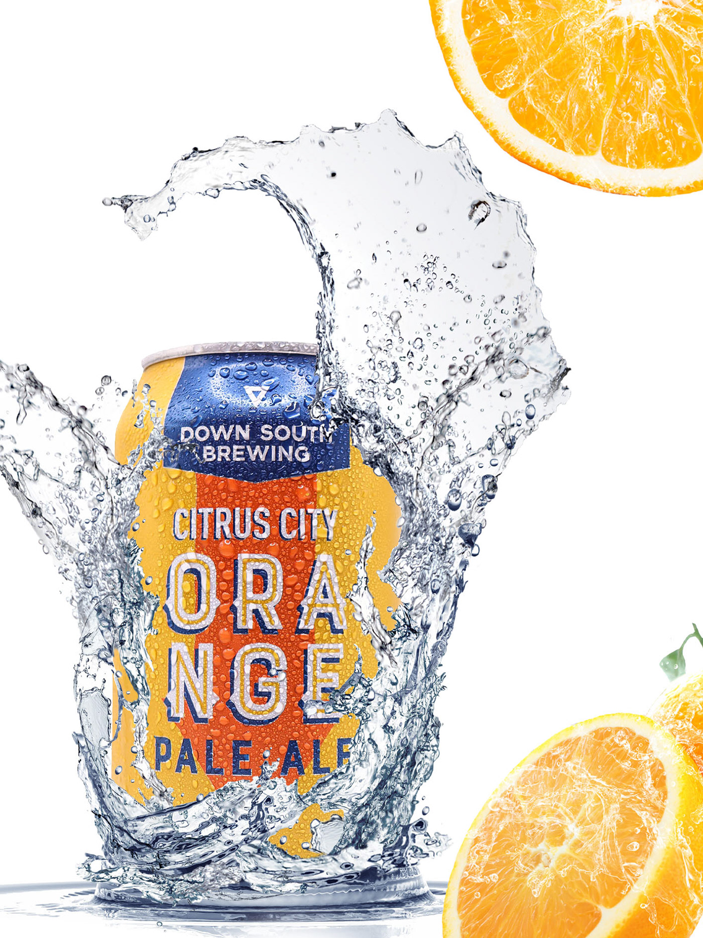
For this project I focused on creating new branding and advertising for the company Lidl. The aim is to rebrand their alcohol section and make it look more luxurious and high-end.
When researching I found a lot of Lidl’s leaflets are overflowing with information which leads to many details being forgotten. So, for my final outcomes I wanted to keep my designs simple, but visually impactful. While also showing how effective design can be when advertising products and the impact this has on consumers buying choices.

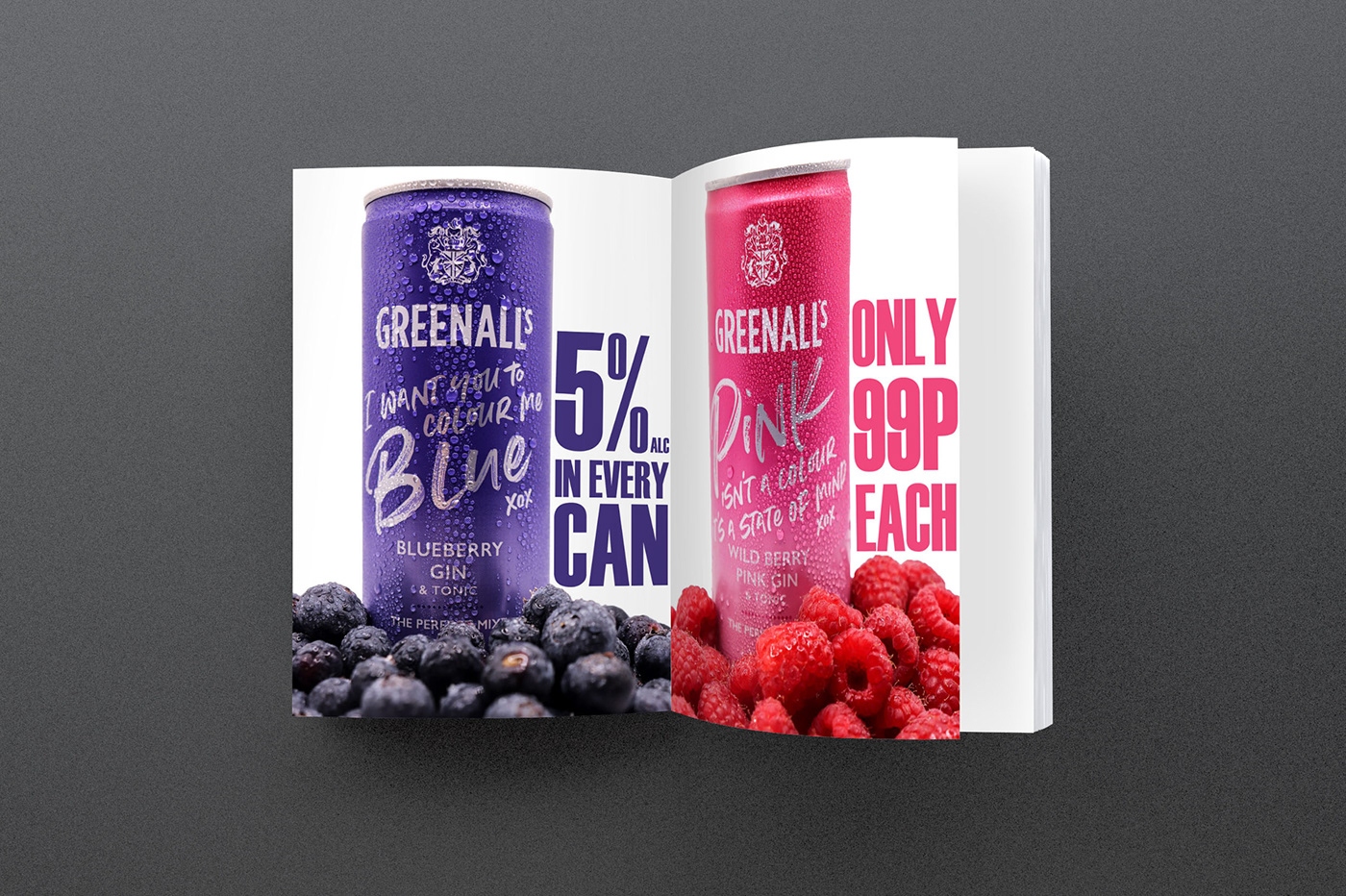
My final body of work displays various leaflet mock-ups and advertising billboards. These are the two main uses of advertisement for Lidl’s, and I feel they are the most effective in showing this rebranding for the company.

For my final body of work I wanted to create four final images. All of which highlight links to my dissertation topic "Is the age of digital photography causing us to reconsider the truth of images?"
Below are my mock ups of my final images which I created with the vision of being used on leaflets and billboards.


In my dissertation I talk about the integrity of an image and keeping it as true to reality as possible, trying to understand why people alter the truth so heavily, especially when editing images. So for my major project I wanted to experiment with this, I created two images which were only slightly edited for the purpose of making the image look as close to what is seen in real life as possible. And the other two images being heavily edited (showing fake smoke and fake splash effects). These two images were created with the purpose of being deceiving to their audience and being untruthful to what is seen in reality.

I will be interested to hear peoples feedback on these different images and which images they feel are more successful in influencing a consumers buying choices.